


+ لینک دانلود استایل جدول تعرفه ها اسکرول خور تصحیح شد
دانلود استایل شیک و زیبا مناسب برای نمایش تعرفه ها بصورت HTML5 / CSS3 و Responsive
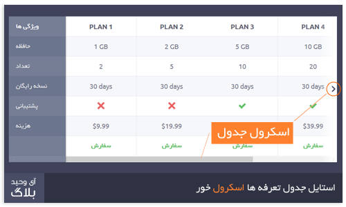
جدول یکی از نیاز های لازم برای طراحی سایت است و این جدول در حین سادگی جذابیت خاصی نیز دارا می باشد که مناسب تمام سایت ها و مخصوصا سایت های هاستینگ و یا سامانه های پیام کوتاه است . یک مشکل بزرگ که بیشتر جداول دارند تعداد ستون محدود است ، اما این جدول تعداد نامحدود ستون را در خود بصورت اسکرول جای میدهد که می توانید در پیش نمایش مشاهده کنید .
توضیحات و کدهای استایل استایل جدول تعرفه ها اسکرول خور

Cross reference table
Whether it’s a subscription plan or a checkout process, you must deal with tables in your projects. And you must deal with responsiveness too. I’ve noticed some websites just cut off some columns to make their tables fits on a phone, but this solution doesn’t work in most cases (at least not if you need 5+ columns). I found this good example of a responsive table which inspired this resource: the list of features gets fixed on a side, allowing the user to horizontally scroll through the columns. Nice
Now why didn’t I use the HTML table structure, and instead went with unordered lists? It was difficult for me to make this resource responsive using proper table semantics (maybe an idea for a future resource). So I thought more about the UX side, and less about the code behind it. Yep, that’s my excuse

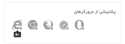
پشتیبانی استایل جدول تعرفه ها اسکرول خور از


